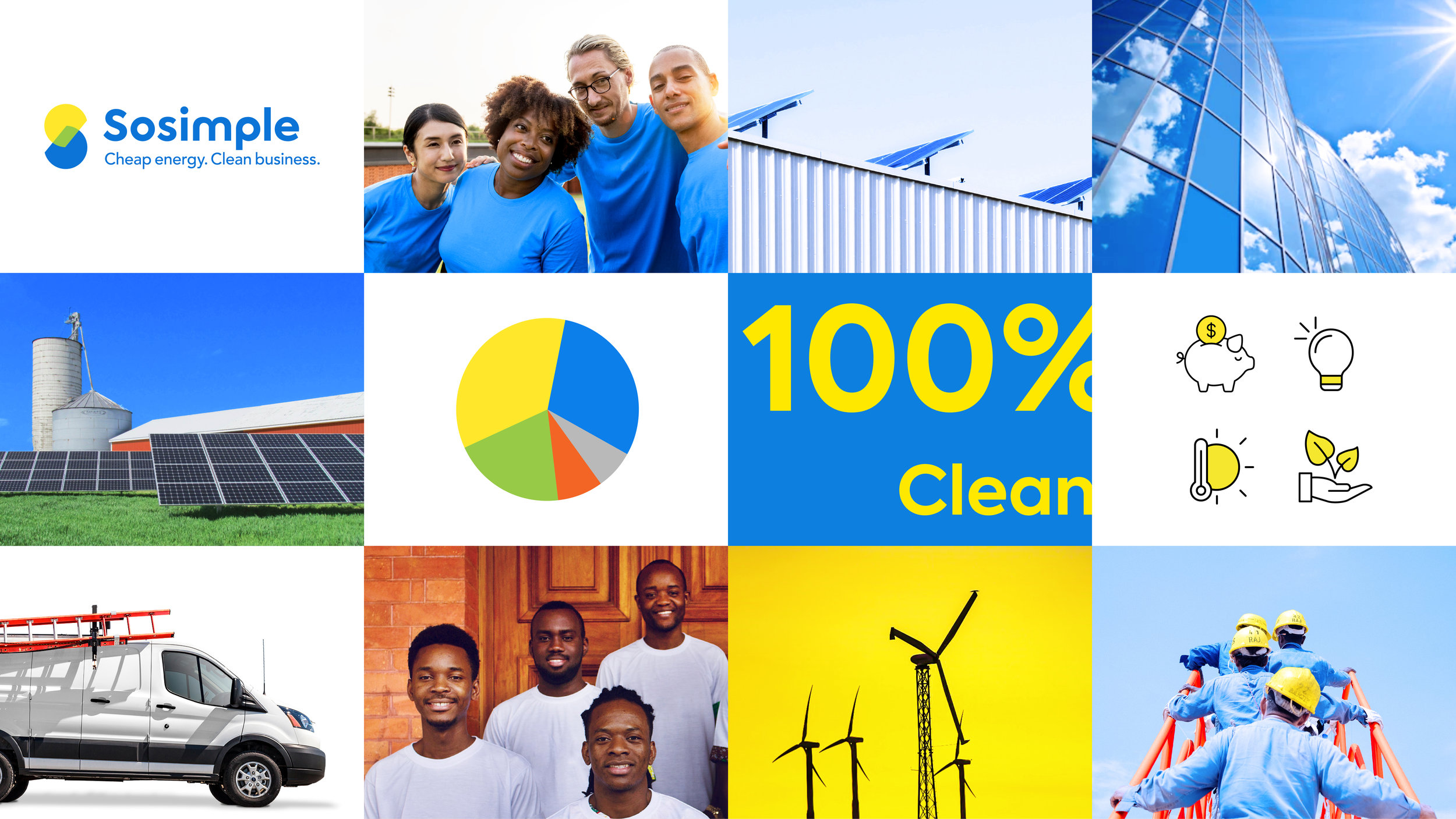
Sosimple
Brand strategy and Brand identity for an energy service provider in South Africa.
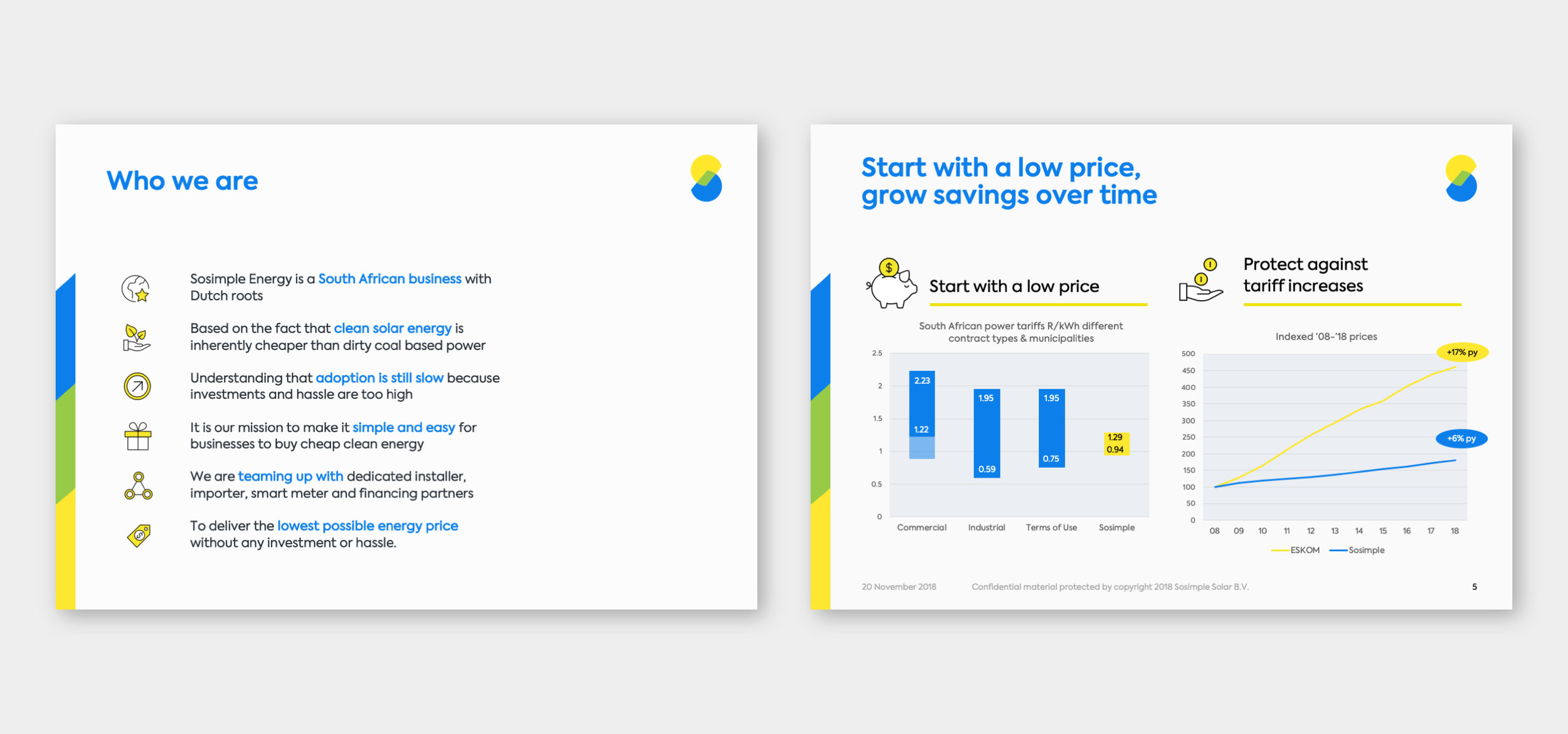
South African energy utility ESKOM has constantly asked for price increases for the past years due to its growth of employee base and debt. Burdening consumers with increased prices purely to keep the company afloat is not a sustainable practice. Since solar energy will be the leading source of energy in the future, South Africa should look to more sustainable, cost-effective, and environmentally friendly alternatives. Therefore, Sosimple was founded to reduce South Africa's dependence on ESKOM with cheaper, cleaner electricity, better service, and to protect its customers’ business from ongoing and unpredictable price hikes.
I worked closely with the creative director to help our clients define the brand positioning and develop the brand strategy and brand identity for Sosimple that brings simplicity and clarity.
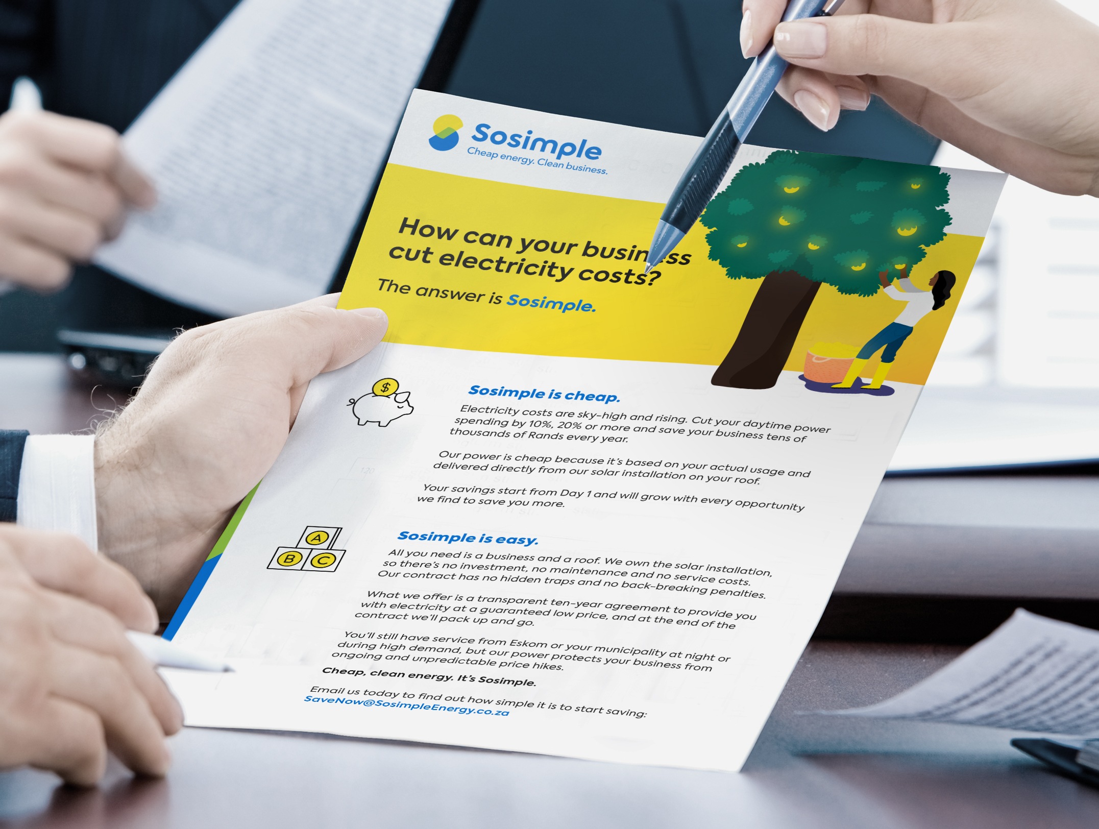
The name “Sosimple” along with the tagline clearly communicates the brand message—“We sell cheap, clean energy. As easy and simple as ABC.” Sosimple promises to sell their consumers low-priced, flexible and clean energy that will immediately reduce their daytime energy costs by 20% or more, delivering more and more savings as they work together. They also promise no upfront investment, no red tape and no trap doors, making it a transparent win-win between entrepreneurs and end users.
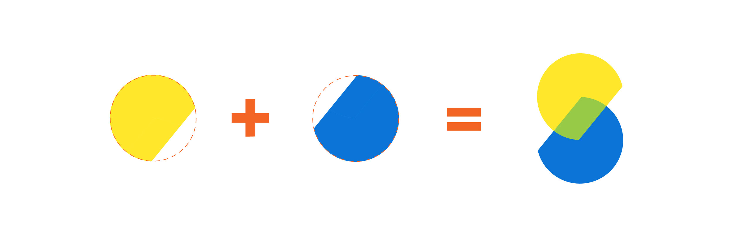
The symbol was found on a simple idea: the energy shift. A circle is split into two parts and these two parts are shifted so that together they form the letter ‘S’.
The color palette comprise a warm yellow representing the Sun, a fresh green representing the earth (bio mass), and a bold blue representing water and the sky (wind)—all potential sources of alternative energy.